Skins
Bootstrap skins
Note: This documentation is for an older version of Bootstrap (v.4). A
newer version is available for Bootstrap 5. We recommend migrating to the latest version of our product - Material Design for
Bootstrap 5.
Go to docs v.5
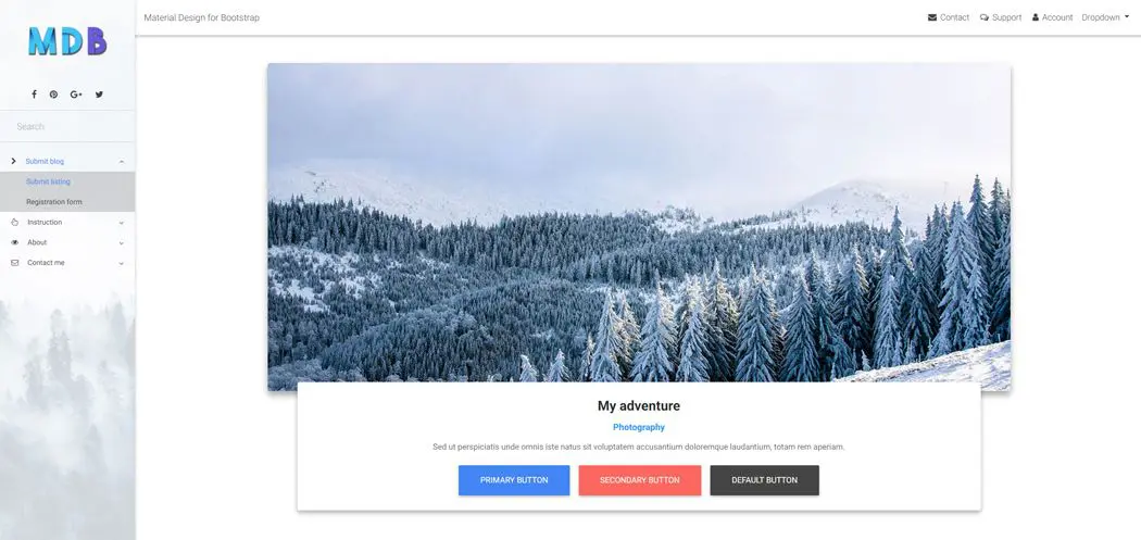
Bootstrap skins are basic color schemes which can be applied for the website providing a ready to use full-page web design.
MDB provides you with a few basic color skin schemes that you might consider applying on your website for a different effect.
To apply a skin you just need to add one of our skin classes to the <body> element.
Skin affects the following elements: navbar, sideNav, footer, button, dropdown, pagination, input, controls of carousel-multi-item, form-header, card-header, spinners, pagination, gradients, primary, secondary, default colors.
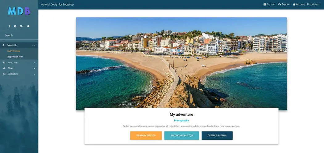
White skin MDB Pro component
<body class="white-skin">
Black skin MDB Pro component
<body class="black-skin">
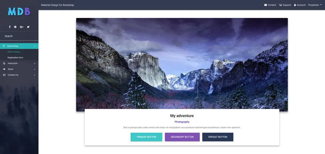
Cyan skin MDB Pro component
<body class="cyan-skin">
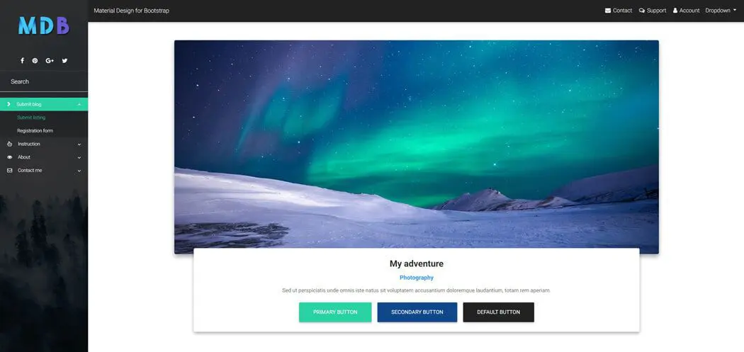
MDB skin MDB Pro component
<body class="mdb-skin">
Deep purple skin MDB Pro component
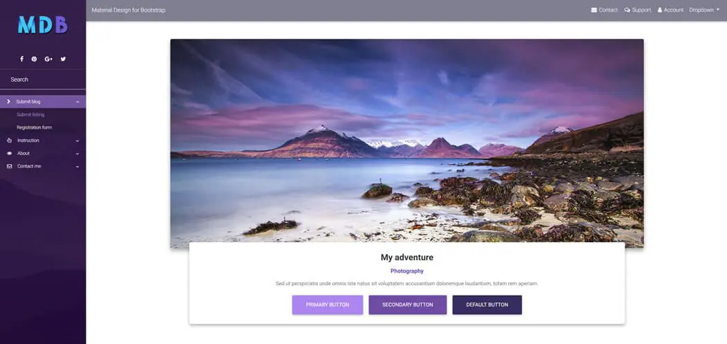
<body class="deep-purple-skin">
Navy blue skin MDB Pro component
<body class="navy-blue-skin">
Pink skin MDB Pro component
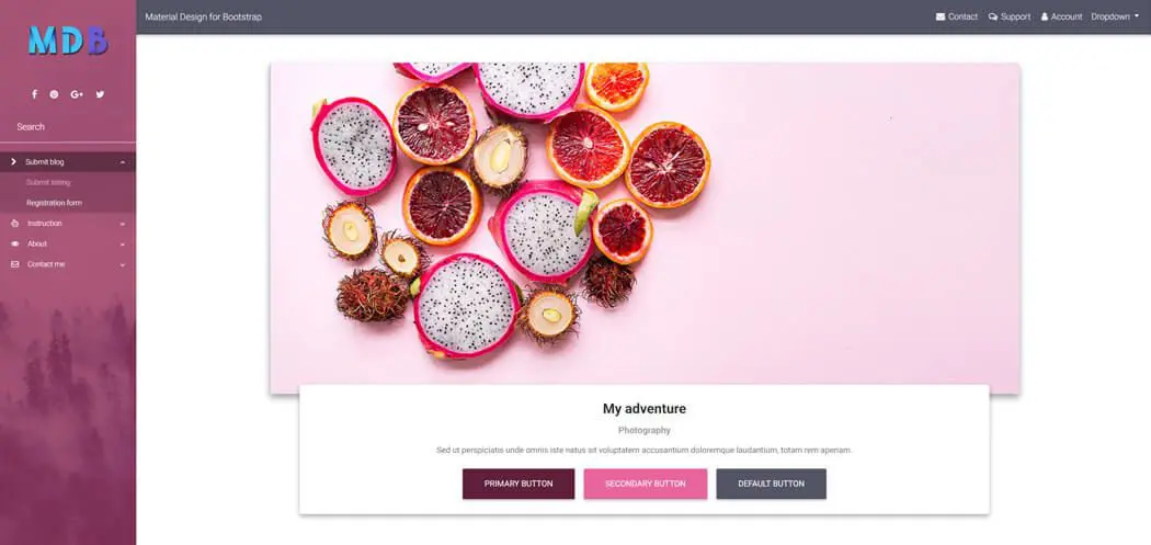
<body class="pink-skin">
Indigo skin MDB Pro component

<body class="indigo-skin">
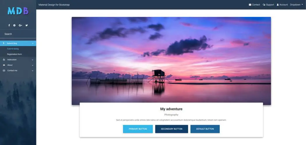
Light blue skin MDB Pro component

<body class="light-blue-skin">
Grey skin MDB Pro component
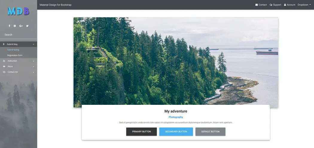
<body class="grey-skin">
It's possible to add a custom skin
From the newest version of MDB - 4.5.2 you have a possibility of adding custom skin. Below we explain in a few steps how to do this. Note: to create the custom skin, it's best to use the MDB Pro Gulp package.
Instruction for adding a custom skin:
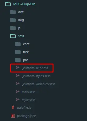
In your package in the SCSS catalog, you can see _custom-skin.scss file.
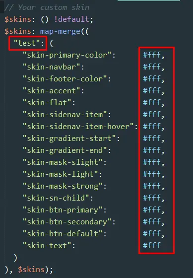
Go to this file and change name of theskin and the values of $skins object to your custom colors and save the file. After that you will have recompiled mdb.css file with your new skin.
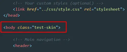
In your HTML file, add to the body tag the class for your custom skin, eg. the .test-skin class.
Description of a skin variables
Below you can find a description of individual variables, i.e. information on which elements of the layout correspond to each of the variables contained in the skin object.
| # | Variable | This variable is used for: |
|---|---|---|
| 1 | skin-primary-color |
|
| 2 | skin-navbar |
|
| 3 | skin-footer-color |
|
| 4 | skin-accent |
|
| 5 | skin-flat |
|
| 6 | skin-sidenav-item |
|
| 7 | skin-sidenav-item-hover |
|
| 8 | skin-gradient-start |
|
| 9 | skin-gradient-end |
|
| 10 | skin-mask-slight |
|
| 11 | skin-mask-light |
|
| 12 | skin-mask-strong |
|
| 13 | skin-sn-child |
|
| 14 | skin-btn-primary |
|
| 15 | skin-btn-secondary |
|
| 16 | skin-btn-default |
|
| 17 | skin-text |
|