React Bootstrap Carousel
React Carousel - Bootstrap 4 & Material Design
Note: We are transitioning MDB4 to a legacy version and focusing on developing MDB5.
While we'll continue to support for the transition period, we encourage you to migrate to
MDB5. We're offering a 50% discount on MDB5 PRO to help with your transition,
enabling you to leverage the full potential of the latest version. You can find more information here.
get 50% discount on MDB5 PRO
The carousel is a slideshow for cycling through a series of content. It works with a series of images, text, or custom markup. It also includes support for previous/next controls and indicators.
Please be aware that nested carousels are not supported, and carousels are generally not compliant with accessibility standards.
Slides only
Here’s a carousel with slides only. Note the presence of the .d-block and .w-100
on carousel images to prevent browser default image alignment.
.webp)
.webp)
.webp)
          import React from "react";
          import {
            MDBCarousel,
            MDBCarouselInner,
            MDBCarouselItem,
            MDBView,
            MDBContainer
          } from "mdbreact";

          const CarouselPage = () => {
            return (
              <MDBContainer>
                <MDBCarousel
                  activeItem={1}
                  length={3}
                  showControls={false}
                  showIndicators={false}
                  className="z-depth-1"
                  slide
                >
                  <MDBCarouselInner>
                    <MDBCarouselItem itemId="1">
                      <MDBView>
                        <img
                          className="d-block w-100"
                          src="https://mdbootstrap.com/img/Photos/Slides/img%20(35).webp"
                          alt="First slide"
                        />
                      </MDBView>
                    </MDBCarouselItem>
                    <MDBCarouselItem itemId="2">
                      <MDBView>
                        <img
                          className="d-block w-100"
                          src="https://mdbootstrap.com/img/Photos/Slides/img%20(33).webp"
                          alt="Second slide"
                        />
                      </MDBView>
                    </MDBCarouselItem>
                    <MDBCarouselItem itemId="3">
                      <MDBView>
                        <img
                          className="d-block w-100"
                          src="https://mdbootstrap.com/img/Photos/Slides/img%20(31).webp"
                          alt="Third slide"
                        />
                      </MDBView>
                    </MDBCarouselItem>
                  </MDBCarouselInner>
                </MDBCarousel>
              </MDBContainer>
            );
          }

          export default CarouselPage;
With controls
Adding in the previous and next controls:
.webp)
.webp)
.webp)
          import React from "react";
          import {
            MDBCarousel,
            MDBCarouselInner,
            MDBCarouselItem,
            MDBView,
            MDBContainer
          } from "mdbreact";

          const CarouselPage = () => {
            return (
              <MDBContainer>
                <MDBCarousel
                  activeItem={1}
                  length={3}
                  showControls={true}
                  showIndicators={false}
                  className="z-depth-1"
                  slide
                >
                  <MDBCarouselInner>
                    <MDBCarouselItem itemId="1">
                      <MDBView>
                        <img
                          className="d-block w-100"
                          src="https://mdbootstrap.com/img/Photos/Slides/img%20(45).webp"
                          alt="First slide"
                        />
                      </MDBView>
                    </MDBCarouselItem>
                    <MDBCarouselItem itemId="2">
                      <MDBView>
                        <img
                          className="d-block w-100"
                          src="https://mdbootstrap.com/img/Photos/Slides/img%20(46).webp"
                          alt="Second slide"
                        />
                      </MDBView>
                    </MDBCarouselItem>
                    <MDBCarouselItem itemId="3">
                      <MDBView>
                        <img
                          className="d-block w-100"
                          src="https://mdbootstrap.com/img/Photos/Slides/img%20(47).webp"
                          alt="Third slide"
                        />
                      </MDBView>
                    </MDBCarouselItem>
                  </MDBCarouselInner>
                </MDBCarousel>
              </MDBContainer>
            );
          }

          export default CarouselPage;
With indicators
You can also add the indicators to the carousel, alongside the controls, too.
.webp)
.webp)
.webp)
          import React from "react";
          import {
            MDBCarousel,
            MDBCarouselInner,
            MDBCarouselItem,
            MDBView,
            MDBContainer
          } from "mdbreact";

          const CarouselPage = () => {
            return (
              <MDBContainer>
                <MDBCarousel
                  activeItem={1}
                  length={3}
                  showControls={true}
                  showIndicators={true}
                  className="z-depth-1"
                >
                  <MDBCarouselInner>
                    <MDBCarouselItem itemId="1">
                      <MDBView>
                        <img
                          className="d-block w-100"
                          src="https://mdbootstrap.com/img/Photos/Slides/img%20(130).webp"
                          alt="First slide"
                        />
                      </MDBView>
                    </MDBCarouselItem>
                    <MDBCarouselItem itemId="2">
                      <MDBView>
                        <img
                          className="d-block w-100"
                          src="https://mdbootstrap.com/img/Photos/Slides/img%20(129).webp"
                          alt="Second slide"
                        />
                      </MDBView>
                    </MDBCarouselItem>
                    <MDBCarouselItem itemId="3">
                      <MDBView>
                        <img
                          className="d-block w-100"
                          src="https://mdbootstrap.com/img/Photos/Slides/img%20(70).webp"
                          alt="Third slide"
                        />
                      </MDBView>
                    </MDBCarouselItem>
                  </MDBCarouselInner>
                </MDBCarousel>
              </MDBContainer>
            );
          }

          export default CarouselPage;
With captions
You can also add the captions to the carousel items.
If your content is not visible enough, you can cover the image with a darker mask.
You can easily change the intensity and color of the mask. To learn more read our MASKS documentation.
.webp)
.webp)
.webp)
          import React from "react";
          import {
            MDBCarousel,
            MDBCarouselInner,
            MDBCarouselItem,
            MDBView,
            MDBContainer
          } from "mdbreact";

          const CarouselPage = () => {
            return (
              <MDBContainer>
                <MDBCarousel
                activeItem={1}
                length={3}
                showControls={true}
                showIndicators={true}
                className="z-depth-1"
              >
                <MDBCarouselInner>
                  <MDBCarouselItem itemId="1">
                    <MDBView>
                      <img
                        className="d-block w-100"
                        src="https://mdbootstrap.com/img/Photos/Slides/img%20(68).webp"
                        alt="First slide"
                      />
                    <MDBMask overlay="black-light" />
                    </MDBView>
                    <MDBCarouselCaption>
                      <h3 className="h3-responsive">Light mask</h3>
                      <p>First text</p>
                    </MDBCarouselCaption>
                  </MDBCarouselItem>
                  <MDBCarouselItem itemId="2">
                    <MDBView>
                      <img
                        className="d-block w-100"
                        src="https://mdbootstrap.com/img/Photos/Slides/img%20(6).webp"
                        alt="Second slide"
                      />
                    <MDBMask overlay="black-strong" />
                    </MDBView>
                    <MDBCarouselCaption>
                      <h3 className="h3-responsive">Strong mask</h3>
                      <p>Second text</p>
                    </MDBCarouselCaption>
                  </MDBCarouselItem>
                  <MDBCarouselItem itemId="3">
                    <MDBView>
                      <img
                        className="d-block w-100"
                        src="https://mdbootstrap.com/img/Photos/Slides/img%20(9).webp"
                        alt="Third slide"
                      />
                    <MDBMask overlay="black-slight" />
                    </MDBView>
                    <MDBCarouselCaption>
                      <h3 className="h3-responsive">Slight Mast</h3>
                      <p>Third text</p>
                    </MDBCarouselCaption>
                  </MDBCarouselItem>
                </MDBCarouselInner>
              </MDBCarousel>
              </MDBContainer>
            );
          }

          export default CarouselPage;
Multi-item carousel MDB Pro component
.webp)
Card title
Some quick example text to build on the card title and make up the bulk of the card's content.
Button.webp)
Card title
Some quick example text to build on the card title and make up the bulk of the card's content.
Button.webp)
Card title
Some quick example text to build on the card title and make up the bulk of the card's content.
Button.webp)
Card title
Some quick example text to build on the card title and make up the bulk of the card's content.
Button.webp)
Card title
Some quick example text to build on the card title and make up the bulk of the card's content.
Button.webp)
Card title
Some quick example text to build on the card title and make up the bulk of the card's content.
Button.webp)
Card title
Some quick example text to build on the card title and make up the bulk of the card's content.
Button.webp)
Card title
Some quick example text to build on the card title and make up the bulk of the card's content.
Button.webp)
Card title
Some quick example text to build on the card title and make up the bulk of the card's content.
Button
        import React from "react";
        import {
          MDBCarousel,
          MDBCarouselInner,
          MDBCarouselItem,
          MDBContainer,
          MDBRow,
          MDBCol,
          MDBCard,
          MDBCardImage,
          MDBCardBody,
          MDBCardTitle,
          MDBCardText,
          MDBBtn
        } from "mdbreact";

        const MultiCarouselPage = () => {
          return (
            <MDBContainer>
              <MDBCarousel activeItem={1} length={3} slide={true} showControls={true} showIndicators={true} multiItem>
                <MDBCarouselInner>
                  <MDBRow>
                    <MDBCarouselItem itemId="1">
                      <MDBCol md="4">
                        <MDBCard className="mb-2">
                          <MDBCardImage className="img-fluid" src="https://mdbootstrap.com/img/Photos/Horizontal/Nature/4-col/img%20(34).webp" />
                          <MDBCardBody>
                            <MDBCardTitle>MDBCard title</MDBCardTitle>
                            <MDBCardText>
                              Some quick example text to build on the card title and
                              make up the bulk of the card's content.
                            </MDBCardText>
                            <MDBBtn color="primary">MDBBtn</MDBBtn>
                          </MDBCardBody>
                        </MDBCard>
                      </MDBCol>
                      <MDBCol md="4">
                        <MDBCard className="mb-2">
                          <MDBCardImage className="img-fluid" src="https://mdbootstrap.com/img/Photos/Horizontal/Nature/4-col/img%20(18).webp" />
                          <MDBCardBody>
                            <MDBCardTitle>MDBCard title</MDBCardTitle>
                            <MDBCardText>
                              Some quick example text to build on the card title and
                              make up the bulk of the card's content.
                            </MDBCardText>
                            <MDBBtn color="primary">MDBBtn</MDBBtn>
                          </MDBCardBody>
                        </MDBCard>
                      </MDBCol>
                      <MDBCol md="4">
                        <MDBCard className="mb-2">
                          <MDBCardImage className="img-fluid" src="https://mdbootstrap.com/img/Photos/Horizontal/Nature/4-col/img%20(35).webp" />
                          <MDBCardBody>
                            <MDBCardTitle>MDBCard title</MDBCardTitle>
                            <MDBCardText>
                              Some quick example text to build on the card title and
                              make up the bulk of the card's content.
                            </MDBCardText>
                            <MDBBtn color="primary">MDBBtn</MDBBtn>
                          </MDBCardBody>
                        </MDBCard>
                      </MDBCol>
                    </MDBCarouselItem>
                    <MDBCarouselItem itemId="2">
                      <MDBCol md="4">
                        <MDBCard className="mb-2">
                          <MDBCardImage className="img-fluid" src="https://mdbootstrap.com/img/Photos/Horizontal/Nature/4-col/img%20(60).webp" />
                          <MDBCardBody>
                            <MDBCardTitle>MDBCard title</MDBCardTitle>
                            <MDBCardText>
                              Some quick example text to build on the card title and
                              make up the bulk of the card's content.
                            </MDBCardText>
                            <MDBBtn color="primary">MDBBtn</MDBBtn>
                          </MDBCardBody>
                        </MDBCard>
                      </MDBCol>
                      <MDBCol md="4">
                        <MDBCard className="mb-2">
                          <MDBCardImage className="img-fluid" src="https://mdbootstrap.com/img/Photos/Horizontal/Nature/4-col/img%20(47).webp" />
                          <MDBCardBody>
                            <MDBCardTitle>MDBCard title</MDBCardTitle>
                            <MDBCardText>
                              Some quick example text to build on the card title and
                              make up the bulk of the card's content.
                            </MDBCardText>
                            <MDBBtn color="primary">MDBBtn</MDBBtn>
                          </MDBCardBody>
                        </MDBCard>
                      </MDBCol>
                      <MDBCol md="4">
                        <MDBCard className="mb-2">
                          <MDBCardImage className="img-fluid" src="https://mdbootstrap.com/img/Photos/Horizontal/Nature/4-col/img%20(48).webp" />
                          <MDBCardBody>
                            <MDBCardTitle>MDBCard title</MDBCardTitle>
                            <MDBCardText>
                              Some quick example text to build on the card title and
                              make up the bulk of the card's content.
                            </MDBCardText>
                            <MDBBtn color="primary">MDBBtn</MDBBtn>
                          </MDBCardBody>
                        </MDBCard>
                      </MDBCol>
                    </MDBCarouselItem>
                    <MDBCarouselItem itemId="3">
                      <MDBCol md="4">
                        <MDBCard className="mb-2">
                          <MDBCardImage className="img-fluid" src="https://mdbootstrap.com/img/Photos/Horizontal/Nature/4-col/img%20(53).webp" />
                          <MDBCardBody>
                            <MDBCardTitle>MDBCard title</MDBCardTitle>
                            <MDBCardText>
                              Some quick example text to build on the card title and
                              make up the bulk of the card's content.
                            </MDBCardText>
                            <MDBBtn color="primary">MDBBtn</MDBBtn>
                          </MDBCardBody>
                        </MDBCard>
                      </MDBCol>
                      <MDBCol md="4">
                        <MDBCard className="mb-2">
                          <MDBCardImage className="img-fluid" src="https://mdbootstrap.com/img/Photos/Horizontal/Nature/4-col/img%20(45).webp" />
                          <MDBCardBody>
                            <MDBCardTitle>MDBCard title</MDBCardTitle>
                            <MDBCardText>
                              Some quick example text to build on the card title and
                              make up the bulk of the card's content.
                            </MDBCardText>
                            <MDBBtn color="primary">MDBBtn</MDBBtn>
                          </MDBCardBody>
                        </MDBCard>
                      </MDBCol>
                      <MDBCol md="4">
                        <MDBCard className="mb-2">
                          <MDBCardImage className="img-fluid" src="https://mdbootstrap.com/img/Photos/Horizontal/Nature/4-col/img%20(41).webp" />
                          <MDBCardBody>
                            <MDBCardTitle>MDBCard title</MDBCardTitle>
                            <MDBCardText>
                              Some quick example text to build on the card title and
                              make up the bulk of the card's content.
                            </MDBCardText>
                            <MDBBtn color="primary">MDBBtn</MDBBtn>
                          </MDBCardBody>
                        </MDBCard>
                      </MDBCol>
                    </MDBCarouselItem>
                  </MDBRow>
                </MDBCarouselInner>
              </MDBCarousel>
            </MDBContainer>
          );
        }

        export default MultiCarouselPage;
React Carousel - API
In this section you will find advanced information about the Carousel component. You will find out which modules are required, what are the possibilities of configuring the component, and what events and methods you can use in working with it.
Carousel import statement
In order to use Carousel component make sure you have imported proper module first.
import { MDBCarousel, MDBCarouselCaption, MDBCarouselInner, MDBCarouselItem } from "mdbreact";
API Reference: Carousel Properties
The table below shows the configuration options of the MDBCarousel component.
| Name | Type | Default | Description | Example |
|---|---|---|---|---|
activeItem |
Number | |
The index of default active item | <MDBCarousel activeItem={1} ... /> |
className |
String | |
Adds custom classes | <MDBCarousel className="myClass" ... /> |
mobileGesture |
Boolean | true |
Switches on/off carousel mobile gesture. | <MDBCarousel mobileGesture={false} ... /> |
multiItem |
Boolean | false |
Switches multiItem mode - more items in one view, changed controls | <MDBCarousel multiItem={true} ... /> |
thumbnails |
Boolean | false |
Replaces simple dot indicators with miniature slides pictures | <MDBCarousel thumbnails ... /> |
interval |
Number | 6000 |
Time in milliseconds between slides changes | <MDBCarousel interval={10000} ... /> |
testimonial |
Boolean | false |
Sets black, bigger control arrows for testimonial carousels | <MDBCarousel testimonial ... /> |
length |
Number | |
Idicates amount of slides in the carousel | <MDBCarousel length={5} ... /> |
onHoverStop |
Boolean | True |
Stops the changing slide when mouse is on the element of the carousel | <MDBCarousel onHoverStop={false} ... /> |
showControls |
Boolean | true |
Switches on/off carousel controls | <MDBCarousel showControls={false} ... /> |
showIndicators |
Boolean | true |
Switches on/off carousel indicators | <MDBCarousel showIndicators={false} ... /> |
slide |
Boolean | false |
Switches slide styles of carousel | <MDBCarousel slide ... /> |
API Reference: CarouselCaption Properties
The table below shows the configuration options of the MDBCarouselCaption component.
| Name | Type | Default | Description | Example |
|---|---|---|---|---|
className |
String | |
Adds custom classes | <MDBCarouselCaption className="customClass" ... /> |
API Reference: CarouselInner Properties
The table below shows the configuration options of the MDBCarouselInner component.
| Name | Type | Default | Description | Example |
|---|---|---|---|---|
className |
String | |
Adds custom classes | <MDBCarouselInner className={customClass} ... /> |
API Reference: CarouselItem Properties
The table below shows the configuration options of the MDBCarouselItem component.
| Name | Type | Default | Description | Example |
|---|---|---|---|---|
itemId |
Number | |
The index of item in carousel | <MDBCarouselInner itemId={1} ... /> |
className |
String | |
Adds custom classes | <MDBCarouselInner className="customClass" ... /> |
React Carousel - examples & customization
Quickly get a project started with any of our examples.
Basic carousel
        import React from 'react';
        import { MDBCarousel, MDBCarouselInner, MDBCarouselItem, MDBView } from 'mdbreact';

        const CarouselPage = () => {
          return (
            <MDBCarousel activeItem={1} length={4} showControls={true} showIndicators={false} className="z-depth-1">
              <MDBCarouselInner>
                <MDBCarouselItem itemId="1">
                  <MDBView>
                    <img className="d-block w-100" src="https://mdbootstrap.com/img/Photos/Slides/img%20(68).webp" alt="First slide" />
                  </MDBView>
                </MDBCarouselItem>
                <MDBCarouselItem itemId="2">
                  <MDBView>
                    <img className="d-block w-100" src="https://mdbootstrap.com/img/Photos/Slides/img%20(99).webp" alt="Second slide" />
                  </MDBView>
                </MDBCarouselItem>
                <MDBCarouselItem itemId="3">
                  <MDBView>
                    <img className="d-block w-100" src="https://mdbootstrap.com/img/Photos/Slides/img%20(17).webp" alt="Third slide" />
                  </MDBView>
                </MDBCarouselItem>
                <MDBCarouselItem itemId="4">
                  <MDBView>
                    <img className="d-block w-100" src="https://mdbootstrap.com/img/Photos/Slides/img%20%28143%29.webp" alt="Mattonit's item" />
                  </MDBView>
                </MDBCarouselItem>
              </MDBCarouselInner>
            </MDBCarousel>
          );
        }

        export default CarouselPage;
Video Carousel
        import React from "react";
        import { MDBCarousel, MDBCarouselInner, MDBCarouselItem, MDBContainer, MDBCol, MDBRow } from "mdbreact";

        const CarouselPage = () => {
          return (
            <MDBContainer className=" mt-4">
              <MDBRow>
                <MDBCol md="12">
                  <MDBCarousel activeItem={1} length={3} showControls={true} showIndicators={true} className="z-depth-1">
                    <MDBCarouselInner>
                      <MDBCarouselItem itemId="1">
                        <video className="video-fluid d-block" autoPlay loop>
                          <source src="https://mdbootstrap.com/img/video/Tropical.mp4" type="video/mp4" />
                        </video>
                      </MDBCarouselItem>
                      <MDBCarouselItem itemId="2">
                        <video className="video-fluid d-block" autoPlay loop>
                          <source src="https://mdbootstrap.com/img/video/forest.mp4" type="video/mp4" />
                        </video>
                      </MDBCarouselItem>
                      <MDBCarouselItem itemId="3">
                        <video className="video-fluid d-block" autoPlay loop>
                          <source src="https://mdbootstrap.com/img/video/Agua-natural.mp4" type="video/mp4" />
                        </video>
                      </MDBCarouselItem>
                    </MDBCarouselInner>
                  </MDBCarousel>
                </MDBCol>
              </MDBRow>
            </MDBContainer>
          );
        }

        export default CarouselPage;
Thumbnails carousel MDB Pro component
.webp)
.webp)
.webp)
.webp)
.webp)
        import React from "react";
        import { MDBCarousel, MDBCarouselInner, MDBCarouselItem, MDBContainer } from "mdbreact";

        const ThumbnailsCarouselPage = () => {
          return (
            <MDBContainer>
              <MDBCarousel activeItem={1} length={3} showControls={true} showIndicators={true} thumbnails className="z-depth-1">
                <MDBCarouselInner>
                  <MDBCarouselItem itemId="1">
                    <img className="d-block w-100" src="https://mdbootstrap.com/img/Photos/Slides/img%20(88).webp" alt="First slide" />
                  </MDBCarouselItem>
                  <MDBCarouselItem itemId="2">
                    <img className="d-block w-100" src="https://mdbootstrap.com/img/Photos/Slides/img%20(121).webp" alt="Second slide" />
                  </MDBCarouselItem>
                  <MDBCarouselItem itemId="3">
                    <img className="d-block w-100" src="https://mdbootstrap.com/img/Photos/Slides/img%20(31).webp" alt="Third slide" />
                  </MDBCarouselItem>
                </MDBCarouselInner>
              </MDBCarousel>
            </MDBContainer>
          );
        }

        export default ThumbnailsCarouselPage;
Products carousel MDB Pro component
Our bestsellers
Lorem ipsum dolor sit amet, consectetur adipisicing elit. Fugit, error amet numquam iure provident voluptate esse quasi, veritatis totam voluptas nostrum quisquam eum porro a pariatur accusamus veniam.
.webp)
Shoes
Leather boots
Neque porro quisquam est, qui dolorem ipsum quia dolor sit amet, consectetur, adipisci.
.webp)
Jeans
Slim jeans
Neque porro quisquam est, qui dolorem ipsum quia dolor sit amet, consectetur, adipisci.
.webp)
Shorts
Denim shorts
Neque porro quisquam est, qui dolorem ipsum quia dolor sit amet, consectetur, adipisci.
.webp)
Accessories
Summer hat
Neque porro quisquam est, qui dolorem ipsum quia dolor sit amet, consectetur, adipisci.
.webp)
Shoes
Black heels
Neque porro quisquam est, qui dolorem ipsum quia dolor sit amet, consectetur, adipisci.
.webp)
Outerwear
Black jacket
Neque porro quisquam est, qui dolorem ipsum quia dolor sit amet, consectetur, adipisci.
.webp)
Accessories
Leather bag
Neque porro quisquam est, qui dolorem ipsum quia dolor sit amet, consectetur, adipisci.
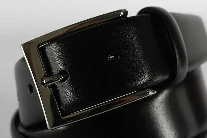
Accessories
Leather belt
Neque porro quisquam est, qui dolorem ipsum quia dolor sit amet, consectetur, adipisci.
.webp)
import React from "react";
import {
MDBCarousel,
MDBCarouselInner,
MDBCarouselItem,
MDBRow,
MDBCol,
MDBCardFooter,
MDBTooltip,
MDBCardTitle,
MDBCard,
MDBCardBody,
MDBCardImage,
MDBCardText
} from "mdbreact";
const CarouselPage = () => {
return (
<section className="text-center my-5">
<h2 className="h1-responsive font-weight-bold text-center my-5">
Our bestsellers
</h2>
<p className="grey-text text-center w-responsive mx-auto mb-5">
Lorem ipsum dolor sit amet, consectetur adipisicing elit. Fugit,
error amet numquam iure provident voluptate esse quasi, veritatis
totam voluptas nostrum quisquam eum porro a pariatur veniam.
</p>
<MDBCarousel activeItem={1} length={3} slide={true} showControls={true} showIndicators={true} multiItem>
<MDBCarouselInner>
<MDBRow>
<MDBCarouselItem itemId="1">
<MDBCol md="4">
<MDBCard narrow ecommerce className="mb-2">
<MDBCardImage cascade top src="https://mdbootstrap.com/img/Photos/Horizontal/E-commerce/Products/img%20(39).webp"
alt="sample photo" />
<MDBCardBody cascade>
<a href="#!" className="text-muted">
<h5>Shoes</h5>
</a>
<MDBCardTitle>
<strong>
<a href="#!">Leather boots</a>
</strong>
</MDBCardTitle>
<MDBCardText>
Neque porro quisquam est, qui dolorem ipsum quia dolor
sit amet, consectetur, adipisci.
</MDBCardText>
<MDBCardFooter className="px-1">
<span className="float-left">69$</span>
<span className="float-right">
<MDBTooltip placement="top" tag="a" component="i" componentClass="fa fa-eye grey-text ml-3"
tooltipContent="Quick look" />
<MDBTooltip placement="top" tag="a" component="i" componentClass="fa fa-heart grey-text ml-3"
tooltipContent="Add to watchlist" />
</span>
</MDBCardFooter>
</MDBCardBody>
</MDBCard>
</MDBCol>
<MDBCol md="4" className="clearfix d-none d-md-block">
<MDBCard narrow ecommerce className="mb-2">
<MDBCardImage cascade top src="https://mdbootstrap.com/img/Photos/Horizontal/E-commerce/Products/img%20(22).webp"
alt="sample photo" />
<MDBCardBody cascade>
<a href="#!" className="text-muted">
<h5>Jeans</h5>
</a>
<MDBCardTitle>
<strong>
<a href="#!">Slim jeans</a>
</strong>
</MDBCardTitle>
<MDBCardText>
Neque porro quisquam est, qui dolorem ipsum quia dolor
sit amet, consectetur, adipisci.
</MDBCardText>
<MDBCardFooter className="px-1">
<span className="float-left">99$</span>
<span className="float-right">
<MDBTooltip placement="top" tag="a" component="i" componentClass="fa fa-eye grey-text ml-3"
tooltipContent="Quick look" />
<MDBTooltip placement="top" tag="a" component="i" componentClass="fa fa-heart grey-text ml-3"
tooltipContent="Add to watchlist" />
</span>
</MDBCardFooter>
</MDBCardBody>
</MDBCard>
</MDBCol>
<MDBCol md="4" className="clearfix d-none d-md-block">
<MDBCard narrow ecommerce className="mb-2">
<MDBCardImage cascade top src="https://mdbootstrap.com/img/Photos/Others/img%20(31).webp" alt="sample photo" />
<MDBCardBody cascade>
<a href="#!" className="text-muted">
<h5>Shorts</h5>
</a>
<MDBCardTitle>
<strong>
<a href="#!">Denim shorts</a>
</strong>
</MDBCardTitle>
<MDBCardText>
Neque porro quisquam est, qui dolorem ipsum quia dolor
sit amet, consectetur, adipisci.
</MDBCardText>
<MDBCardFooter className="px-1">
<span className="float-left">49$</span>
<span className="float-right">
<MDBTooltip placement="top" tag="a" component="i" componentClass="fa fa-eye grey-text ml-3"
tooltipContent="Quick look" />
<MDBTooltip placement="top" tag="a" component="i" componentClass="fa fa-heart grey-text ml-3"
tooltipContent="Add to watchlist" />
</span>
</MDBCardFooter>
</MDBCardBody>
</MDBCard>
</MDBCol>
</MDBCarouselItem>
<MDBCarouselItem itemId="2">
<MDBCol md="4">
<MDBCard narrow ecommerce className="mb-2">
<MDBCardImage cascade top src="https://mdbootstrap.com/img/Photos/Horizontal/E-commerce/Products/img%20(30).webp"
alt="sample photo" />
<MDBCardBody cascade>
<a href="#!" className="text-muted">
<h5>Shoes</h5>
</a>
<MDBCardTitle>
<strong>
<a href="#!">Leather boots</a>
</strong>
</MDBCardTitle>
<MDBCardText>
Neque porro quisquam est, qui dolorem ipsum quia dolor
sit amet, consectetur, adipisci.
</MDBCardText>
<MDBCardFooter className="px-1">
<span className="float-left">69$</span>
<span className="float-right">
<MDBTooltip placement="top" tag="a" component="i" componentClass="fa fa-eye grey-text ml-3"
tooltipContent="Quick look" />
<MDBTooltip placement="top" tag="a" component="i" componentClass="fa fa-heart grey-text ml-3"
tooltipContent="Add to watchlist" />
</span>
</MDBCardFooter>
</MDBCardBody>
</MDBCard>
</MDBCol>
<MDBCol md="4" className="clearfix d-none d-md-block">
<MDBCard narrow ecommerce className="mb-2">
<MDBCardImage cascade top src="https://mdbootstrap.com/img/Photos/Horizontal/E-commerce/Products/img%20(37).webp"
alt="sample photo" />
<MDBCardBody cascade>
<a href="#!" className="text-muted">
<h5>Jeans</h5>
</a>
<MDBCardTitle>
<strong>
<a href="#!">Slim jeans</a>
</strong>
</MDBCardTitle>
<MDBCardText>
Neque porro quisquam est, qui dolorem ipsum quia dolor
sit amet, consectetur, adipisci.
</MDBCardText>
<MDBCardFooter className="px-1">
<span className="float-left">99$</span>
<span className="float-right">
<MDBTooltip placement="top" tag="a" component="i" componentClass="fa fa-eye grey-text ml-3"
tooltipContent="Quick look" />
<MDBTooltip placement="top" tag="a" component="i" componentClass="fa fa-heart grey-text ml-3"
tooltipContent="Add to watchlist" />
</span>
</MDBCardFooter>
</MDBCardBody>
</MDBCard>
</MDBCol>
<MDBCol md="4" className="clearfix d-none d-md-block">
<MDBCard narrow ecommerce className="mb-2">
<MDBCardImage cascade top src="https://mdbootstrap.com/img/Photos/Others/img%20(35).webp" alt="sample photo" />
<MDBCardBody cascade>
<a href="#!" className="text-muted">
<h5>Shorts</h5>
</a>
<MDBCardTitle>
<strong>
<a href="#!">Denim shorts</a>
</strong>
</MDBCardTitle>
<MDBCardText>
Neque porro quisquam est, qui dolorem ipsum quia dolor
sit amet, consectetur, adipisci.
</MDBCardText>
<MDBCardFooter className="px-1">
<span className="float-left">49$</span>
<span className="float-right">
<MDBTooltip placement="top" tag="a" component="i" componentClass="fa fa-eye grey-text ml-3"
tooltipContent="Quick look" />
<MDBTooltip placement="top" tag="a" component="i" componentClass="fa fa-heart grey-text ml-3"
tooltipContent="Add to watchlist" />
</span>
</MDBCardFooter>
</MDBCardBody>
</MDBCard>
</MDBCol>
</MDBCarouselItem>
<MDBCarouselItem itemId="3">
<MDBCol md="4">
<MDBCard narrow ecommerce className="mb-2">
<MDBCardImage cascade top src="https://mdbootstrap.com/img/Photos/Horizontal/E-commerce/Products/img%20(32).webp"
alt="sample photo" />
<MDBCardBody cascade>
<a href="#!" className="text-muted">
<h5>Shoes</h5>
</a>
<MDBCardTitle>
<strong>
<a href="#!">Leather boots</a>
</strong>
</MDBCardTitle>
<MDBCardText>
Neque porro quisquam est, qui dolorem ipsum quia dolor
sit amet, consectetur, adipisci.
</MDBCardText>
<MDBCardFooter className="px-1">
<span className="float-left">69$</span>
<span className="float-right">
<MDBTooltip placement="top" tag="a" component="i" componentClass="fa fa-eye grey-text ml-3"
tooltipContent="Quick look" />
<MDBTooltip placement="top" tag="a" component="i" componentClass="fa fa-heart grey-text ml-3"
tooltipContent="Add to watchlist" />
</span>
</MDBCardFooter>
</MDBCardBody>
</MDBCard>
</MDBCol>
<MDBCol md="4" className="clearfix d-none d-md-block">
<MDBCard narrow ecommerce className="mb-2">
<MDBCardImage cascade top src="https://mdbootstrap.com/img/Photos/Horizontal/E-commerce/Products/img%20(33).webp"
alt="sample photo" />
<MDBCardBody cascade>
<a href="#!" className="text-muted">
<h5>Jeans</h5>
</a>
<MDBCardTitle>
<strong>
<a href="#!">Slim jeans</a>
</strong>
</MDBCardTitle>
<MDBCardText>
Neque porro quisquam est, qui dolorem ipsum quia dolor
sit amet, consectetur, adipisci.
</MDBCardText>
<MDBCardFooter className="px-1">
<span className="float-left">99$</span>
<span className="float-right">
<MDBTooltip placement="top" tag="a" component="i" componentClass="fa fa-eye grey-text ml-3"
tooltipContent="Quick look" />
<MDBTooltip placement="top" tag="a" component="i" componentClass="fa fa-heart grey-text ml-3"
tooltipContent="Add to watchlist" />
</span>
</MDBCardFooter>
</MDBCardBody>
</MDBCard>
</MDBCol>
<MDBCol md="4" className="clearfix d-none d-md-block">
<MDBCard narrow ecommerce className="mb-2">
<MDBCardImage cascade top src="https://mdbootstrap.com/img/Photos/Others/img%20(38).webp" alt="sample photo" />
<MDBCardBody cascade>
<a href="#!" className="text-muted">
<h5>Shorts</h5>
</a>
<MDBCardTitle>
<strong>
<a href="#!">Denim shorts</a>
</strong>
</MDBCardTitle>
<MDBCardText>
Neque porro quisquam est, qui dolorem ipsum quia dolor
sit amet, consectetur, adipisci.
</MDBCardText>
<MDBCardFooter className="px-1">
<span className="float-left">49$</span>
<span className="float-right">
<MDBTooltip placement="top" tag="a" component="i" componentClass="fa fa-eye grey-text ml-3"
tooltipContent="Quick look" />
<MDBTooltip placement="top" tag="a" component="i" componentClass="fa fa-heart grey-text ml-3"
tooltipContent="Add to watchlist" />
</span>
</MDBCardFooter>
</MDBCardBody>
</MDBCard>
</MDBCol>
</MDBCarouselItem>
</MDBRow>
</MDBCarouselInner>
</MDBCarousel>
</section>
);
}
export default CarouselPage;
Products carousel in modal MDB Pro component
.webp)
.webp)
.webp)
Product Name
$49
$89
        import React, { Component } from 'react';
        import {
          MDBContainer,
          MDBBtn,
          MDBModal,
          MDBCol,
          MDBCarouselInner,
          MDBCard,
          MDBCardBody,
          MDBCarousel,
          MDBModalBody,
          MDBCollapseHeader,
          MDBCarouselItem,
          MDBSelectOption,
          MDBSelectOptions,
          MDBRow,
          MDBSelect,
          MDBSelectInput,
          MDBCollapse,
          MDBIcon
        } from 'mdbreact';

        class ModalPage extends Component {
          state = {
            modal13: false,
            accordion: 1
          }

          toggle = nr => () => {
            let modalNumber = 'modal' + nr;
            this.setState({
              [modalNumber]: !this.state[modalNumber]
            });
          }

          onClick = nr => () => {
            this.setState({
              accordion: nr
            });
          }

          render() {
            const { accordion } = this.state;

            return (
              <MDBContainer>
                <MDBBtn onClick={this.toggle(13)}>Launch MDBModalBody</MDBBtn>
                <MDBModal size="lg" isOpen={this.state.modal13} toggle={this.toggle(13)}>
                  <MDBModalBody className="d-flex">
                    <MDBCol size="5" lg="5">
                      <MDBCarousel activeItem={1} length={3} showControls={true} showIndicators={true} thumbnails className="z-depth-1">
                        <MDBCarouselInner>
                          <MDBCarouselItem itemId="1">
                            <img className="d-block w-100" src="https://mdbootstrap.com/img/Photos/Horizontal/E-commerce/Vertical/img%20(23).webp"
                              alt="First slide" />
                          </MDBCarouselItem>
                          <MDBCarouselItem itemId="2">
                            <img className="d-block w-100" src="https://mdbootstrap.com/img/Photos/Horizontal/E-commerce/Vertical/img%20(24).webp"
                              alt="Second slide" />
                          </MDBCarouselItem>
                          <MDBCarouselItem itemId="3">
                            <img className="d-block w-100" src="https://mdbootstrap.com/img/Photos/Horizontal/E-commerce/Vertical/img%20(25).webp"
                              alt="Third slide" />
                          </MDBCarouselItem>
                        </MDBCarouselInner>
                      </MDBCarousel>
                    </MDBCol>
                    <MDBCol size="7" lg="7">
                      <h2 className="h2-responsive product-name">
                        <strong>Product Name</strong>
                      </h2>
                      <h4 className="h4-responsive">
                        <span className="green-text">
                          <strong>$49</strong>
                        </span>
                        <span className="grey-text ml-1">
                          <small>
                            <s>$89</s>
                          </small>
                        </span>
                      </h4>
                      <div className="my-4">
                        <MDBCard>
                          <MDBCollapseHeader onClick={this.onClick(1)}>Description
                            <i className={"ml-1 " + (accordion === 1 ? 'fa fa-angle-down rotate-icon' : 'fa fa-angle-down')}></i>
                          </MDBCollapseHeader>
                          <MDBCollapse isOpen={accordion === 1}>
                            <MDBCardBody>
                              Anim pariatur cliche reprehenderit, enim eiusmod high life accusamus terry richardson ad squid. 3 wolf moon officia aute, non cupidatat skateboard dolor brunch. Food truck quinoa nesciunt laborum eiusmod.
                            </MDBCardBody>
                          </MDBCollapse>
                        </MDBCard>
                        <MDBCard>
                          <MDBCollapseHeader onClick={this.onClick(2)}>Details
                            <i className={"ml-1 " + (accordion === 2 ? 'fa fa-angle-down rotate-icon' : 'fa fa-angle-down')}></i>
                          </MDBCollapseHeader>
                          <MDBCollapse isOpen={accordion === 2}>
                            <MDBCardBody>
                              Anim pariatur cliche reprehenderit, enim eiusmod high life accusamus terry richardson ad squid. 3 wolf moon officia aute, non cupidatat skateboard dolor brunch. Food truck quinoa nesciunt laborum eiusmod.
                            </MDBCardBody>
                          </MDBCollapse>
                        </MDBCard>
                        <MDBCard>
                          <MDBCollapseHeader onClick={this.onClick(3)}>Shipping
                            <i className={"ml-1 " + (accordion === 3 ? 'fa fa-angle-down rotate-icon' : 'fa fa-angle-down')}></i>
                          </MDBCollapseHeader>
                          <MDBCollapse isOpen={accordion === 3}>
                            <MDBCardBody>
                              Anim pariatur cliche reprehenderit, enim eiusmod high life accusamus terry richardson ad squid. 3 wolf moon officia aute, non cupidatat skateboard dolor brunch. Food truck quinoa nesciunt laborum eiusmod.
                            </MDBCardBody>
                          </MDBCollapse>
                        </MDBCard>
                      </div>
                      <MDBRow>
                        <MDBCol size="6">
                          <MDBSelect>
                            <MDBSelectInput></MDBSelectInput>
                            <MDBSelectOptions>
                              <MDBSelectOption disabled>Choose your option</MDBSelectOption>
                              <MDBSelectOption>White</MDBSelectOption>
                              <MDBSelectOption>Black</MDBSelectOption>
                              <MDBSelectOption>Pink</MDBSelectOption>
                            </MDBSelectOptions>
                          </MDBSelect>
                          <label>MDBSelect color</label>
                        </MDBCol>
                        <MDBCol size="6">
                          <MDBSelect>
                            <MDBSelectInput></MDBSelectInput>
                            <MDBSelectOptions>
                              <MDBSelectOption disabled>Choose your option</MDBSelectOption>
                              <MDBSelectOption>White</MDBSelectOption>
                              <MDBSelectOption>Black</MDBSelectOption>
                              <MDBSelectOption>Pink</MDBSelectOption>
                            </MDBSelectOptions>
                          </MDBSelect>
                          <label>MDBSelect size</label>
                        </MDBCol>
                    </MDBRow>
                    <MDBRow className="justify-content-center">
                      <MDBBtn color="secondary" className="ml-4" onClick={this.toggle(13)}>Close</MDBBtn>
                      <MDBBtn color="primary" className="ml-4" onClick={this.toggle(13)}>Add to Cart
                        <MDBIcon icon="cart-plus" className="ml-2" />
                      </MDBBtn>
                    </MDBRow>
                    </MDBCol>
                  </MDBModalBody>
                </MDBModal>
              </MDBContainer>
            );
          }
        }

        export default ModalPage;
Testimonials carousel MDB Pro component
Testimonials
.webp)
Lorem ipsum dolor sit amet, consectetur adipisicing elit. Quod eos id officiis hic tenetur quae quaerat ad velit ab. Lorem ipsum dolor sit amet, consectetur adipisicing elit. Dolore cum accusamus eveniet molestias voluptatum inventore laboriosam labore sit, aspernatur praesentium iste impedit quidem dolor veniam.
Anna Deynah
Founder at ET Company
.webp)
Nemo enim ipsam voluptatem quia voluptas sit aspernatur aut odit aut fugit, sed quia consequuntur magni dolores eos qui ratione voluptatem sequi nesciunt. Neque porro quisquam est, qui dolorem ipsum quia dolor sit amet, consectetur, adipisci velit, sed quia non numquam eius modi tempora incidunt ut labore.
Maria Kate
Photographer at Studio LA
.webp)
Duis aute irure dolor in reprehenderit in voluptate velit esse cillum dolore eu fugiat nulla pariatur. Excepteur sint occaecat cupidatat non proident, sunt in culpa qui officia deserunt mollit anim id est laborum. Sed ut perspiciatis unde omnis iste natus error sit voluptatem accusantium doloremque laudantium.
John Doe
Front-end Developer in NY
        import React from "react";
        import {
          MDBContainer,
          MDBAvatar,
          MDBIcon,
          MDBCarousel,
          MDBCarouselInner,
          MDBCarouselItem,
          MDBTestimonial
        } from "mdbreact";

        const TestimonialsPage = () => {
          return (
            <MDBContainer>
              <section className="text-center my-5">
                <h2 className="h1-responsive font-weight-bold my-5">
                  Testimonials v.2
                </h2>

                <MDBCarousel activeItem={1} length={3} testimonial interval={false} showIndicators={false} className="no-flex">
                  <MDBCarouselInner>
                    <MDBCarouselItem itemId="1">
                      <MDBTestimonial>
                        <MDBAvatar className="mx-auto mb-4">
                          <img src="https://mdbootstrap.com/img/Photos/Avatars/img%20(30).webp" className="rounded-circle img-fluid"
                            alt="" />
                        </MDBAvatar>
                        <p>
                          <MDBIcon icon="quote-left" /> Lorem ipsum dolor sit amet,
                          consectetur adipisicing elit. Quod eos id officiis hic
                          tenetur quae quaerat ad velit ab. Lorem ipsum dolor sit
                          amet, consectetur adipisicing elit. Dolore cum accusamus
                          eveniet molestias voluptatum inventore laboriosam labore
                          sit, aspernatur praesentium iste impedit quidem dolor
                          veniam.
                        </p>
                        <h4 className="font-weight-bold">Anna Deynah</h4>
                        <h6 className="font-weight-bold my-3">
                          Founder at ET Company
                        </h6>
                        <MDBIcon icon="star" className="blue-text" />
                        <MDBIcon icon="star" className="blue-text" />
                        <MDBIcon icon="star" className="blue-text" />
                        <MDBIcon icon="star" className="blue-text" />
                        <MDBIcon icon="star-half" className="blue-text" />
                      </MDBTestimonial>
                    </MDBCarouselItem>
                    <MDBCarouselItem itemId="2">
                      <MDBTestimonial>
                        <MDBAvatar className="mx-auto mb-4">
                          <img src="https://mdbootstrap.com/img/Photos/Avatars/img%20(31).webp" className="rounded-circle img-fluid"
                            alt="" />
                        </MDBAvatar>
                        <p>
                          <MDBIcon icon="quote-left" /> Nemo enim ipsam voluptatem quia
                          voluptas sit aspernatur aut odit aut fugit, sed quia
                          consequuntur magni dolores eos qui ratione voluptatem sequi
                          nesciunt. Neque porro quisquam est, qui dolorem ipsum quia
                          dolor sit amet, consectetur, adipisci velit, sed quia non
                          numquam eius modi tempora incidunt ut labore.
                        </p>
                        <h4 className="font-weight-bold">Maria Kate</h4>
                        <h6 className="font-weight-bold my-3">
                          Photographer at Studio LA
                        </h6>
                        <MDBIcon icon="star" className="blue-text" />
                        <MDBIcon icon="star" className="blue-text" />
                        <MDBIcon icon="star" className="blue-text" />
                        <MDBIcon icon="star" className="blue-text" />
                        <MDBIcon icon="star" className="blue-text" />
                      </MDBTestimonial>
                    </MDBCarouselItem>
                    <MDBCarouselItem itemId="3">
                      <MDBTestimonial>
                        <MDBAvatar className="mx-auto mb-4">
                          <img src="https://mdbootstrap.com/img/Photos/Avatars/img%20(3).webp" className="rounded-circle img-fluid"
                            alt="" />
                        </MDBAvatar>
                        <p>
                          <MDBIcon icon="quote-left" /> Duis aute irure dolor in
                          reprehenderit in voluptate velit esse cillum dolore eu
                          fugiat nulla pariatur. Excepteur sint occaecat cupidatat non
                          proident, sunt in culpa qui officia deserunt mollit anim id
                          est laborum. Sed ut perspiciatis unde omnis iste natus error
                          sit voluptatem accusantium doloremque laudantium.
                        </p>
                        <h4 className="font-weight-bold">John Doe</h4>
                        <h6 className="font-weight-bold my-3">
                          Front-end Developer in NY
                        </h6>
                        <MDBIcon icon="star" className="blue-text" />
                        <MDBIcon icon="star" className="blue-text" />
                        <MDBIcon icon="star" className="blue-text" />
                        <MDBIcon icon="star" className="blue-text" />
                        <MDBIcon icon="star" className="blue-text" />
                      </MDBTestimonial>
                    </MDBCarouselItem>
                  </MDBCarouselInner>
                </MDBCarousel>
              </section>
            </MDBContainer>
          );
        }

        export default TestimonialsPage;
Testimonials multi-carousel MDB Pro component
Testimonials v.4
.webp)
Anna Deynah
Web Designer
Lorem ipsum dolor sit amet, consectetur adipisicing elit. Quod eos id officiis hic tenetur.
.webp)
John Doe
Web Developer
Ut enim ad minima veniam, quis nostrum exercitationem ullam corporis suscipit laboriosam.
Abbey Clark
Photographer
Quis autem vel eum iure reprehenderit qui in ea voluptate velit esse quam nihil molestiae.
.webp)
Blake Dabney
Web Designer
Ut enim ad minima veniam, quis nostrum exercitationem ullam corporis laboriosam.
.webp)
Andrea Clay
Front-end developer
Lorem ipsum dolor sit amet, consectetur adipisicing elit. Quod eos id officiis hic tenetur quae.
.webp)
Cami Gosse
Phtographer
At vero eos et accusamus et iusto odio dignissimos ducimus qui blanditiis praesentium.
.webp)
Bobby Haley
Web Developer
Lorem ipsum dolor sit amet, consectetur adipisicing elit. Quod eos id officiis hic tenetur quae.
.webp)
Elisa Janson
Marketer
At vero eos et accusamus et iusto odio dignissimos ducimus qui blanditiis praesentium.
.webp)
Robert Jacobs
Front-end developer
Ut enim ad minima veniam, quis nostrum exercitationem ullam corporis laboriosam.
import React from "react";
import {
MDBCarousel,
MDBCarouselInner,
MDBCarouselItem,
MDBContainer,
MDBRow,
MDBCol,
MDBTestimonial,
MDBAvatar,
MDBIcon
} from "mdbreact";
const TestimonialsMultiPage = () => {
return (
<MDBContainer>
<section className="text-center my-5">
<h2 className="h1-responsive font-weight-bold my-5">
Testimonials v.4
</h2>
<MDBCarousel activeItem={1} length={3} slide={true} showControls={true} multiItem testimonial>
<MDBCarouselInner>
<MDBRow>
<MDBCarouselItem itemId="1">
<MDBCol md="4">
<MDBTestimonial>
<MDBAvatar className="mx-auto">
<img src="https://mdbootstrap.com/img/Photos/Avatars/img%20(26).webp" alt="" className="rounded-circle img-fluid" />
</MDBAvatar>
<h4 className="font-weight-bold mt-4">Anna Deynah</h4>
<h6 className="blue-text font-weight-bold my-3">
Web Designer
</h6>
<p className="font-weight-normal">
<MDBIcon icon="quote-left" className="pr-2" />
Lorem ipsum dolor sit amet, consectetur adipisicing
elit. Quod eos id officiis hic tenetur.
</p>
<div className="grey-text">
<MDBIcon icon="star" />
<MDBIcon icon="star" />
<MDBIcon icon="star" />
<MDBIcon icon="star" />
<MDBIcon icon="star-half" />
</div>
</MDBTestimonial>
</MDBCol>
<MDBCol md="4" className="clearfix d-none d-md-block">
<MDBTestimonial>
<MDBAvatar className="mx-auto">
<img src="https://mdbootstrap.com/img/Photos/Avatars/img%20(27).webp" alt="" className="rounded-circle img-fluid" />
</MDBAvatar>
<h4 className="font-weight-bold mt-4">John Doe</h4>
<h6 className="blue-text font-weight-bold my-3">
Web Developer
</h6>
<p className="font-weight-normal">
<MDBIcon icon="quote-left" className="pr-2" />
Ut enim ad minima veniam, quis nostrum exercitationem
ullam corporis laboriosam.
</p>
<div className="grey-text">
<MDBIcon icon="star" />
<MDBIcon icon="star" />
<MDBIcon icon="star" />
<MDBIcon icon="star" />
<MDBIcon icon="star" />
</div>
</MDBTestimonial>
</MDBCol>
<MDBCol md="4" className="clearfix d-none d-md-block">
<MDBTestimonial>
<MDBAvatar className="mx-auto">
<img src="https://mdbootstrap.com/img/Photos/Avatars/img%20(31).webp" alt="" className="rounded-circle img-fluid" />
</MDBAvatar>
<h4 className="font-weight-bold mt-4">Abbey Clark</h4>
<h6 className="blue-text font-weight-bold my-3">
Photographer
</h6>
<p className="font-weight-normal">
<MDBIcon icon="quote-left" className="pr-2" />
Quis autem vel eum iure reprehenderit qui in ea
voluptate velit esse quam nihil molestiae.
</p>
<div className="grey-text">
<MDBIcon icon="star" />
<MDBIcon icon="star" />
<MDBIcon icon="star" />
<MDBIcon icon="star" />
<MDBIcon icon="star" />
</div>
</MDBTestimonial>
</MDBCol>
</MDBCarouselItem>
<MDBCarouselItem itemId="2">
<MDBCol md="4">
<MDBTestimonial>
<MDBAvatar className="mx-auto">
<img src="https://mdbootstrap.com/img/Photos/Avatars/img%20(4).webp" alt="" className="rounded-circle img-fluid" />
</MDBAvatar>
<h4 className="font-weight-bold mt-4">Blake Dabney</h4>
<h6 className="blue-text font-weight-bold my-3">
Web Designer
</h6>
<p className="font-weight-normal">
<MDBIcon icon="quote-left" className="pr-2" />
Ut enim ad minima veniam, quis nostrum exercitationem
ullam corporis laboriosam.
</p>
<div className="grey-text">
<MDBIcon icon="star" />
<MDBIcon icon="star" />
<MDBIcon icon="star" />
<MDBIcon icon="star" />
<MDBIcon icon="star-half" />
</div>
</MDBTestimonial>
</MDBCol>
<MDBCol md="4" className="clearfix d-none d-md-block">
<MDBTestimonial>
<MDBAvatar className="mx-auto">
<img src="https://mdbootstrap.com/img/Photos/Avatars/img%20(6).webp" alt="" className="rounded-circle img-fluid" />
</MDBAvatar>
<h4 className="font-weight-bold mt-4">Andrea Clay</h4>
<h6 className="blue-text font-weight-bold my-3">
Front-end developer
</h6>
<p className="font-weight-normal">
<MDBIcon icon="quote-left" className="pr-2" />
Lorem ipsum dolor sit amet, consectetur adipisicing
elit. Quod eos id officiis hic tenetur quae.
</p>
<div className="grey-text">
<MDBIcon icon="star" />
<MDBIcon icon="star" />
<MDBIcon icon="star" />
<MDBIcon icon="star" />
<MDBIcon icon="star" />
</div>
</MDBTestimonial>
</MDBCol>
<MDBCol md="4" className="clearfix d-none d-md-block">
<MDBTestimonial>
<MDBAvatar className="mx-auto">
<img src="https://mdbootstrap.com/img/Photos/Avatars/img%20(7).webp" alt="" className="rounded-circle img-fluid" />
</MDBAvatar>
<h4 className="font-weight-bold mt-4">Cami Gosse</h4>
<h6 className="blue-text font-weight-bold my-3">
Phtographer
</h6>
<p className="font-weight-normal">
<MDBIcon icon="quote-left" className="pr-2" />
At vero eos et accusamus et iusto odio dignissimos
ducimus qui blanditiis praesentium.
</p>
<div className="grey-text">
<MDBIcon icon="star" />
<MDBIcon icon="star" />
<MDBIcon icon="star" />
<MDBIcon icon="star" />
<MDBIcon icon="star" />
</div>
</MDBTestimonial>
</MDBCol>
</MDBCarouselItem>
<MDBCarouselItem itemId="3">
<MDBCol md="4">
<MDBTestimonial>
<MDBAvatar className="mx-auto">
<img src="https://mdbootstrap.com/img/Photos/Avatars/img%20(8).webp" alt="" className="rounded-circle img-fluid" />
</MDBAvatar>
<h4 className="font-weight-bold mt-4">Bobby Haley</h4>
<h6 className="blue-text font-weight-bold my-3">
Web Developer
</h6>
<p className="font-weight-normal">
<MDBIcon icon="quote-left" className="pr-2" />
Lorem ipsum dolor sit amet, consectetur adipisicing
elit. Quod eos id officiis hic tenetur quae.
</p>
<div className="grey-text">
<MDBIcon icon="star" />
<MDBIcon icon="star" />
<MDBIcon icon="star" />
<MDBIcon icon="star" />
<MDBIcon icon="star" />
</div>
</MDBTestimonial>
</MDBCol>
<MDBCol md="4" className="clearfix d-none d-md-block">
<MDBTestimonial>
<MDBAvatar className="mx-auto">
<img src="https://mdbootstrap.com/img/Photos/Avatars/img%20(10).webp" alt="" className="rounded-circle img-fluid" />
</MDBAvatar>
<h4 className="font-weight-bold mt-4">Elisa Janson</h4>
<h6 className="blue-text font-weight-bold my-3">
Marketer
</h6>
<p className="font-weight-normal">
<MDBIcon icon="quote-left" className="pr-2" />
At vero eos et accusamus et iusto odio dignissimos
ducimus qui blanditiis praesentium.
</p>
<div className="grey-text">
<MDBIcon icon="star" />
<MDBIcon icon="star" />
<MDBIcon icon="star" />
<MDBIcon icon="star" />
<MDBIcon icon="star-half" />
</div>
</MDBTestimonial>
</MDBCol>
<MDBCol md="4" className="clearfix d-none d-md-block">
<MDBTestimonial>
<MDBAvatar className="mx-auto">
<img src="https://mdbootstrap.com/img/Photos/Avatars/img%20(9).webp" alt="" className="rounded-circle img-fluid" />
</MDBAvatar>
<h4 className="font-weight-bold mt-4">Rob Jacobs</h4>
<h6 className="blue-text font-weight-bold my-3">
Front-end developer
</h6>
<p className="font-weight-normal">
<MDBIcon icon="quote-left" className="pr-2" />
Ut enim ad minima veniam, quis nostrum exercitationem
ullam corporis laboriosam.
</p>
<div className="grey-text">
<MDBIcon icon="star" />
<MDBIcon icon="star" />
<MDBIcon icon="star" />
<MDBIcon icon="star" />
<MDBIcon icon="star" />
</div>
</MDBTestimonial>
</MDBCol>
</MDBCarouselItem>
</MDBRow>
</MDBCarouselInner>
</MDBCarousel>
</section>
</MDBContainer>
);
}
export default TestimonialsMultiPage;