React Bootstrap Masonry
React Masonry - Bootstrap 4 & Material Design
Note: We are transitioning MDB4 to a legacy version and focusing on developing MDB5.
While we'll continue to support for the transition period, we encourage you to migrate to
MDB5. We're offering a 50% discount on MDB5 PRO to help with your transition,
enabling you to leverage the full potential of the latest version. You can find more information here.
get 50% discount on MDB5 PRO
React Bootstrap masonry is a grid layout based on columns. Unlike other grid layouts, it doesn’t have fixed height rows. Basically, Masonry layout optimizes the use of space inside the web page by reducing any unnecessary gaps. Without this type of layout, certain restrictions are required to maintain the structure of layout.
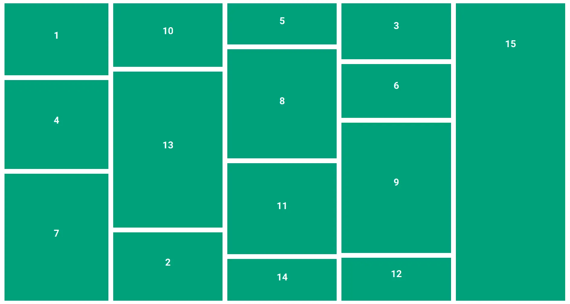
Basic layout
          import React from "react";
          import ReactDOM from 'react-dom';
          import { MDBRow } from "mdbreact";

          class MasonryPage extends React.Component {
            constructor() {
              super();

              this.MasonryRef = React.createRef();
            }

            componentDidMount() {
              this.arrangeMasonry();
            }

            arrangeMasonry = () => {
              const numCols = 3;
              const colHeights = Array(numCols).fill(0);
              const container = ReactDOM.findDOMNode(this.MasonryRef.current);

              Array.from(container.children).forEach((child, i) => {
                const order = i % numCols;
                child.style.order = order;
                colHeights[order] += parseFloat(child.clientHeight);
              })
              container.style.height = Math.max(...colHeights) + 'px';
            }

            render() {
              return (
                <MDBRow className="masonry-with-columns" ref={this.MasonryRef}>
                  <div style={{ order: 0 }}>
                    1
                  </div>
                  <div style={{ order: 1 }}>
                    2
                  </div>
                  <div style={{ order: 2 }}>
                    3
                  </div>
                  <div style={{ order: 0 }}>
                    4
                  </div>
                  <div style={{ order: 1 }}>
                    5
                  </div>
                  <div style={{ order: 2 }}>
                    6
                  </div>
                  <div style={{ order: 0 }}>
                    7
                  </div>
                  <div style={{ order: 1 }}>
                    8
                  </div>
                  <div style={{ order: 2 }}>
                    9
                  </div>
                  <div style={{ order: 0 }}>
                    10
                  </div>
                  <div style={{ order: 1 }}>
                    11
                  </div>
                  <div style={{ order: 2 }}>
                    12
                  </div>
                  <div style={{ order: 0 }}>
                    13
                  </div>
                  <div style={{ order: 1 }}>
                    14
                  </div>
                  <div style={{ order: 2 }}>
                    15
                  </div>
                </MDBRow>
              );
            }
          }
            // Within style tags in your html file
            body {
              margin: 0;
              padding: 1rem;
            }
            // SCSS
            // Masonry layout vertical
            .masonry-with-columns {
              display: flex;
              flex-direction: column;
              flex-wrap: wrap;
              max-height: 1000px;
              div {
                flex: 1 0 auto;
                background: #00997B;
                color: white;
                margin: 0 1rem 1rem 0;
                text-align: center;
                font-weight: 900;
                font-size: 2rem;
              }
              @for $i from 1 through 36 {
                div:nth-child(#{$i}) {
                  $h: (random(400) + 100) + px);
                  height: $h;
                  line-height: $h;
                }
              }
            }
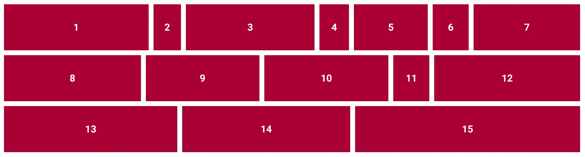
Horizontal option
          import React from "react";
          import { MDBRow } from "mdbreact";

          class MasonryPage extends React.Component {
            render() {
              return (
                <MDBRow className="masonry-with-columns-2">
                  <div>
                    1
                  </div>
                  <div>
                    2
                  </div>
                  <div>
                    3
                  </div>
                  <div>
                    4
                  </div>
                  <div>
                    5
                  </div>
                  <div>
                    6
                  </div>
                  <div>
                    7
                  </div>
                  <div>
                    8
                  </div>
                  <div>
                    9
                  </div>
                  <div>
                    10
                  </div>
                  <div>
                    11
                  </div>
                  <div>
                    12
                  </div>
                  <div>
                    13
                  </div>
                  <div>
                    14
                  </div>
                  <div>
                    15
                  </div>
                </MDBRow>
              );
            }
          }
            // Within style tags in your html file
            body {
              margin: 0;
              padding: 1rem;
            }
            // SCSS
            // Masonry layout horizontal
            .masonry-with-columns-2 {
              display: flex;
              flex-wrap: wrap;
              div {
                height: 150px;
                line-height: 150px;
                background: #9B1B30;
                color: white;
                margin: 0 1rem 1rem 0;
                text-align: center;
                font-weight: 900;
                font-size: 2rem;
                flex: 1 0 auto;
              }
              @for $i from 1 through 36 {
                div:nth-child(#{$i}) {
                  $h: (random(400) + 70) + px);
                  width: $h;
                }
              }
            }
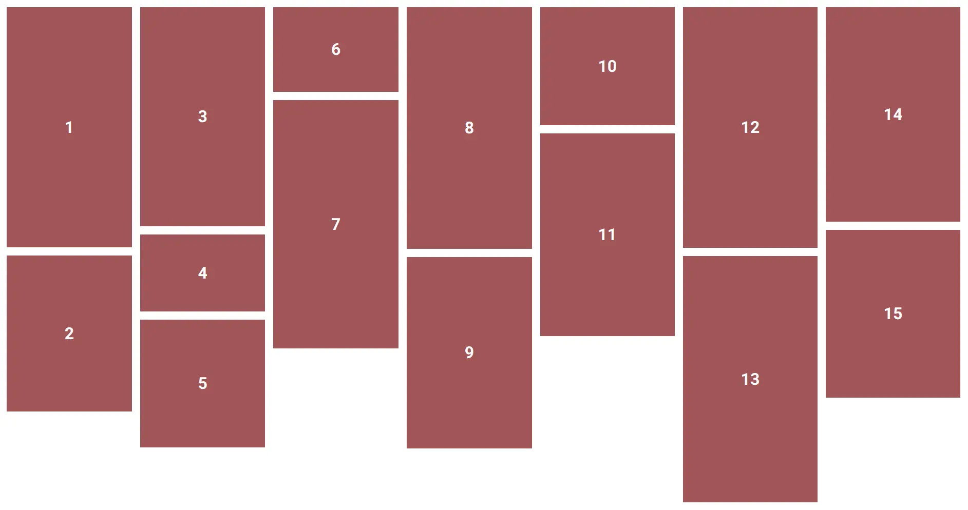
Flexbox option
          import React from "react";
          import { MDBRow } from "mdbreact";

          class MasonryPage extends React.Component {
            render() {
              return (
                <MDBRow className="masonry-with-flex">
                  <div>
                    1
                  </div>
                  <div>
                    2
                  </div>
                  <div>
                    3
                  </div>
                  <div>
                    4
                  </div>
                  <div>
                    5
                  </div>
                  <div>
                    6
                  </div>
                  <div>
                    7
                  </div>
                  <div>
                    8
                  </div>
                  <div>
                    9
                  </div>
                  <div>
                    10
                  </div>
                  <div>
                    11
                  </div>
                  <div>
                    12
                  </div>
                  <div>
                    13
                  </div>
                  <div>
                    14
                  </div>
                  <div>
                    15
                  </div>
                </MDBRow>
              );
            }
          }
            // Within style tags in your html file
            body {
              margin: 0;
              padding: 1rem;
            }
            // SCSS
            // Masonry layout flex
            .masonry-with-flex {
              display: flex;
              flex-direction: column;
              flex-wrap: wrap;
              max-height: 1000px;
              div {
                width: auto;
                background: #975A58;
                color: white;
                margin: 0 1rem 1rem 0;
                text-align: center;
                font-weight: 900;
                font-size: 2rem;
              }
              @for $i from 1 through 36 {
                div:nth-child(#{$i}) {
                  $h: (random(400) + 100) + px);
                  height: $h;
                  line-height: $h;
                }
              }
            }